Design isn’t just about making things look good. It’s about making them work better for the people who use them. That’s why we’re thrilled to announce that we’ve released a completely overhauled look and feel for the Hightouch app, completely geared toward our customers.
We’ve worked hard to maintain the same powerful and accessible Hightouch you know and love while making it even more intuitive, engaging, and delightful.
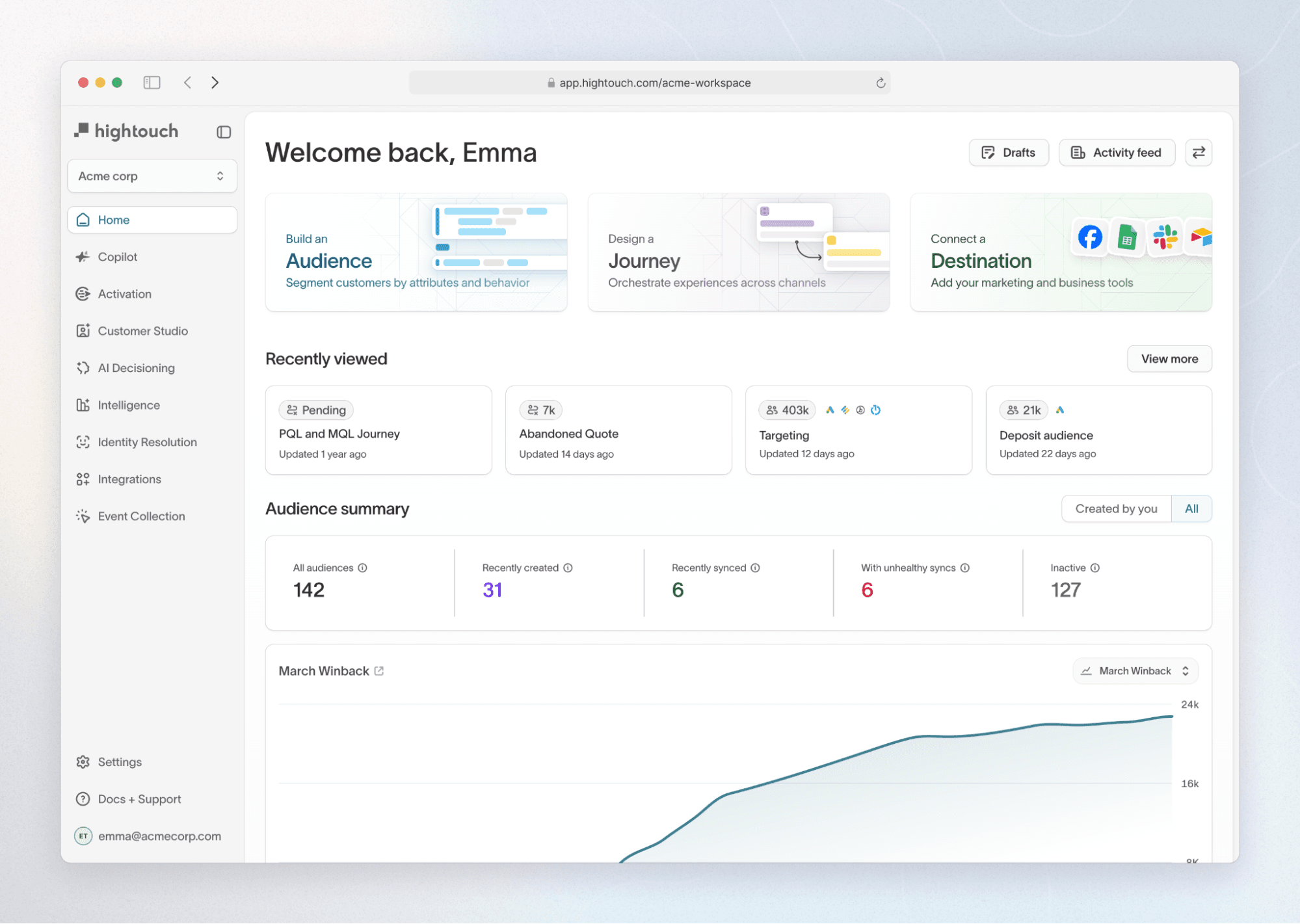
The new direction brings bigger, more legible type, clearer interaction states, and patterns that feel intuitive to non-technical users. While your core workflows remain exactly the same, we’ve enhanced how it feels to use the product.
Think of this update as laying a new foundation: We’ve made the product more approachable today — while setting the stage for workflow improvements and entirely new features in the months ahead.
Why redesign now?
We’re always heads down building value for our customers. Over time, it became clear our brand and interface were still speaking to a more technical audience, even though our fastest-growing user base is marketing teams.
Marketers use Hightouch differently than data teams. They need clarity, speed, and a visual language that feels natural to them. The data-heavy patterns of our previous design weren’t telling the full story anymore.
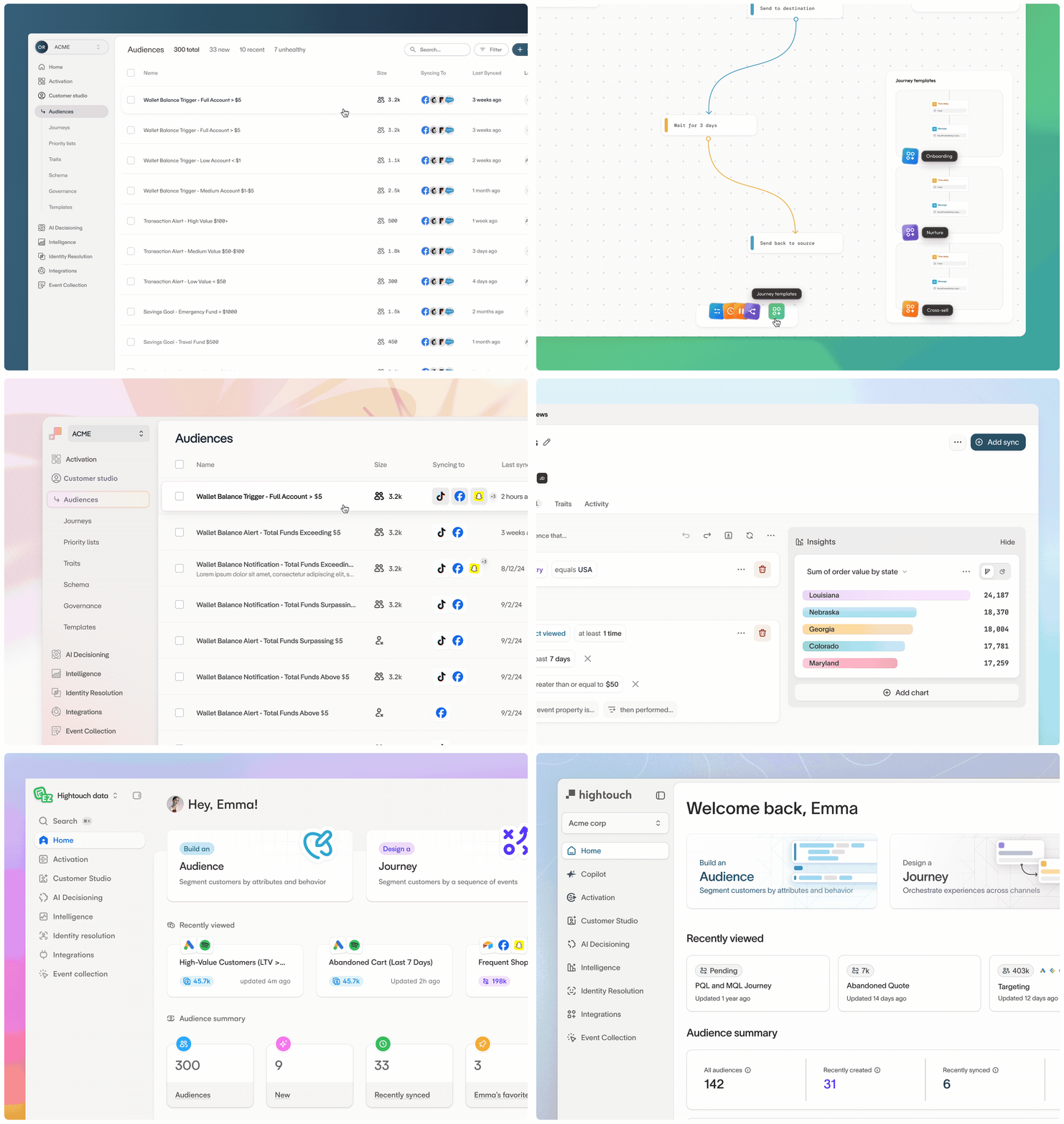
After months of research, hundreds of design explorations, and close collaboration across teams, we developed a new visual language that expands our color palette, sharpens the details, and creates a more focused, approachable experience for marketers — without abandoning what’s worked well for our technical audiences.
The principles behind our redesign
Color that conveys meaning
Color is one of the fastest ways to communicate information. When you glance at a chart, a status indicator, or a workflow step, the meaning should be instantly clear.
Our previous green-dominant palette made the interface feel uniform, but limited our ability to signal importance and guide attention.
The new color system opens up the palette so we can:
- Make data visualizations pop with more contrast and variety
- Use color intentionally to indicate state, highlight changes, and tell richer stories
- Bring more warmth and approachability to the app without sacrificing clarity
Focus on your content
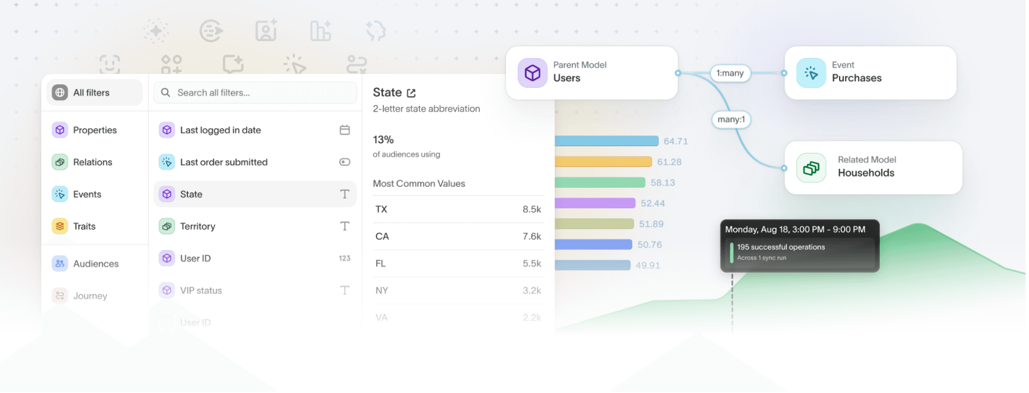
Hightouch exists to help teams work with data, not distract from it. The goal of this change is simple: make your content the star and keep the interface in a supporting role.
In the old layout, navigation and UI elements sometimes competed with the content you came to see.
We’ve introduced:
- Cleaner page layouts that give more breathing room to your data
- A collapsible primary navigation so you can go full-focus when you need to
- A refined type hierarchy so the most important information always stands out
Improved legibility and accessibility
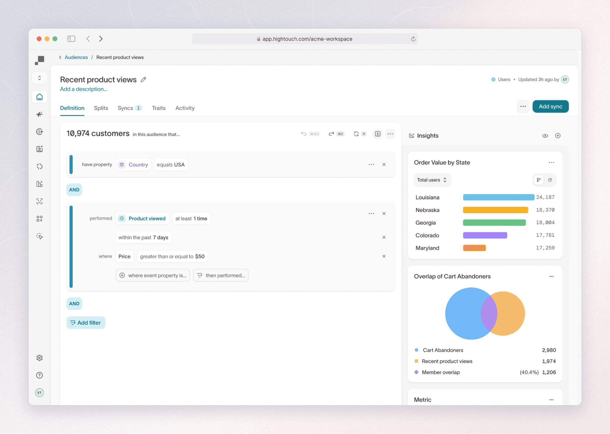
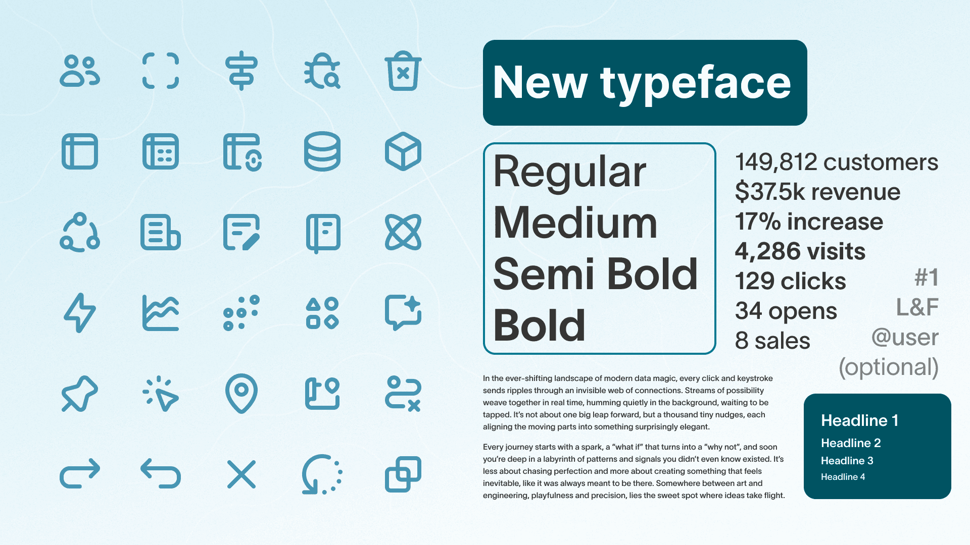
It’s never been easier to understand what’s going on in HIghtouch. We’ve refined our typeface and increased font sizes. We’ve introduced 150+ new custom icons to help convey meaning alongside our text. And, most importantly, we’ve improved our accessibility across the app, ensuring that any user can use Hightouch to the fullest of their ability.
You’ll now see:
- Larger text sizes
- 150+ new custom icons
- Clearer focused, active, and disabled state for interactive elements
Why this matters as we look ahead
This is more than a fresh coat of paint. It’s a signal of where we’re headed. We’re leaning into design craft at a time when quick hacks are everywhere.
To us, craft means sweating the details, learning from each other, and building products people actually love to use. This redesign is the latest example of that — an investment in quality that you’ll feel in every click, scroll, and interaction.
This is just the first milestone. With our new design foundation in place, we’ll continue to evolve workflows, refine patterns, and build entirely new experiences for marketing teams.
The best way to see where we’re headed? Open Hightouch and explore. We think you’ll notice the difference right away.


