If you’re reading this, then you are probably:
- Someone who makes dashboards as part of your job
- Someone who provides data for dashboards as part of your job
- Someone who looks at dashboards as part of your job
- All of the above
As someone who falls squarely into category four and loves funnel dashboards, I have something sort of unpleasant to say: dashboards are pretty annoying.
Funnel dashboards are supposed to be a user-friendly place where business people can find insights and interesting customer segments derived from ready-made modeled data without needing technical skills or engineering resources.
What they mostly do is create shamanistic data review rituals that eat up precious working hours and spew out endless requests for “more cuts of data” that rarely result in anything. When there actually is an awesome data point or insight uncovered, that information usually needs to be exported into a static CSV (making it immediately out of date) and imported to some other system to be loaded and used.
So, what is going on?
What are Funnel Dashboards for?
In my opinion, funnel dashboards do three jobs in most organizations.
Job 1: Forcing function to understand the inputs and outputs of your process
Everyone wants the output of a funnel chart (new customers, new orders, qualified opportunities, etc.), but it’s actually shockingly rare for businesses to understand the origin of those outputs.
It’s only by working backward from the outcome (e.g., new paying customers) all the way to the point of initial contact or discovery (e.g., first marketing touch point) that businesses start to deeply understand where their money comes from and what levers are available to affect that outcome.
Then you need to model the data, visualize it–and voila–you can (often for the first time) see the relationship between the stuff you are doing and the stuff that is happening.
Grade for funnel dashboards on Job 1: A+
Job 2: A real-time-ish gauge of how well your business is performing
Once you have all the data cleaned up and visualized, you need to look at the data. You need to look at it all the time and try to understand the causality of your colorful little lines moving.
Here’s the bad bit–causality is almost never obvious. Your colorful lines will tell you that something good (or bad) is happening–but will rarely tell you why. Then the search for causality triggers the dreaded I-word: Investigations. This will take a ton of time, create many new dashboards that rarely get used, and divert marketing teams away from the actions that actually drive growth, and only lead to new understanding sometimes.
It also has a pretty huge opportunity cost–instead of interesting proactive work to figure out “How can we grow faster?” or “What causes LTV to go up?,” you spend a lot of precious analyst time on the reactive work of “Why did that line go down?”
That said, there is good news too! Some of the time you will understand causality. You will find a segment of customers you can better target. Or a new advertising channel that is working. Or a product use case that is starting to take off.
And when you do, it not only feels awesome, but it also gives you an actionable step you can take to build a better product and make more money.
Grade for funnel dashboards on Job 2: B-
That leads us to…
Job 3: Provide segmented lists of customer data that you can use to do stuff
Marketer Alert: This is where we talk about the painful reality of downloading and uploading CSVs.
Because dashboards have clean and tangible representations of customer segments, those dashboards are organized in ways that business people understand, and they inevitably end up triggering what seems like a simple request:
- “Hey, could I get that list of customers for an email?”
- “Hey, could I get that list of customers for the sales team?”
- “Hey, could I get that list of customers for an ad campaign?”
Or the really scary ones like:
- “Hey, could I get that list of customers cut by geo with recent purchasers excluded?"
Before you know it, the analytics team is buried under countless requests to produce segments, export them to CSVs, new smaller tables, or even more dashboards. Every export creates a data quality and governance risk. But every export is “urgent” for that campaign the CMO needed yesterday.
Between the endless investigations and deeper segment creation from Job 2, and the endless list of exports from Job 3, no one is doing anything else.
Say goodbye to interesting, proactive work like churn prediction, LTV modeling, pipeline maintenance, and all the rest. These stay in the backlog, keeping analytics work reactive.
Grade for funnel dashboards on Job 3: Fail.
So how can Data Activation Help?
As we’re seeing, dashboards don’t fully address that “last mile” of analytics: getting business users to actually take action on the data consistently.
But for all its flaws, BI is not obsolete by any means; it just shouldn’t be the end goal of analytics. The issue is the misuse of smaller cuts of data segments requested by countless business users. Every CSV has to be manually uploaded to an ad platform or SaaS tool and that bedevils analyst teams, hijacks their capacity, and keeps them from doing higher-order work.
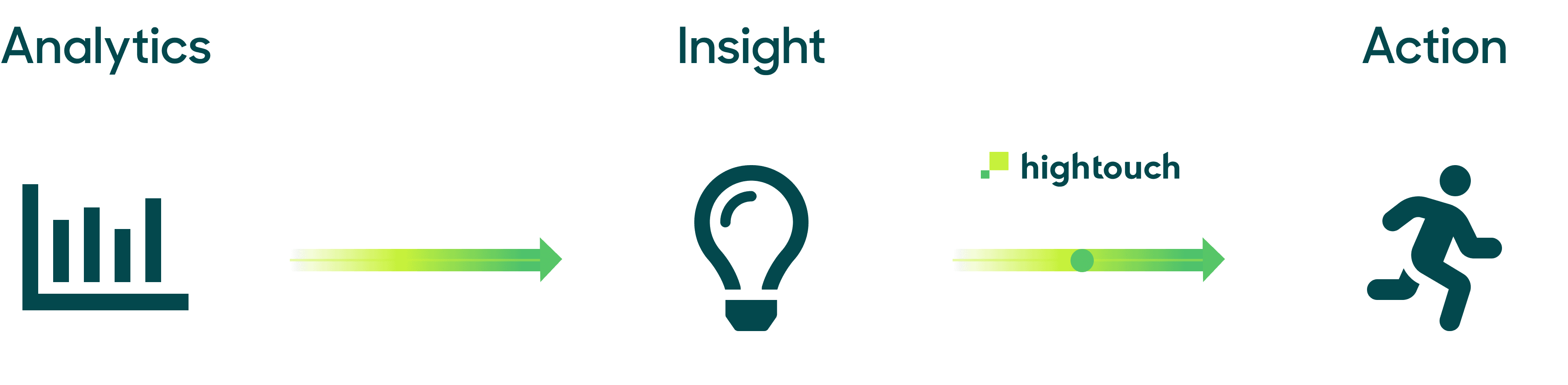
Raise your hand if this image looks familiar.
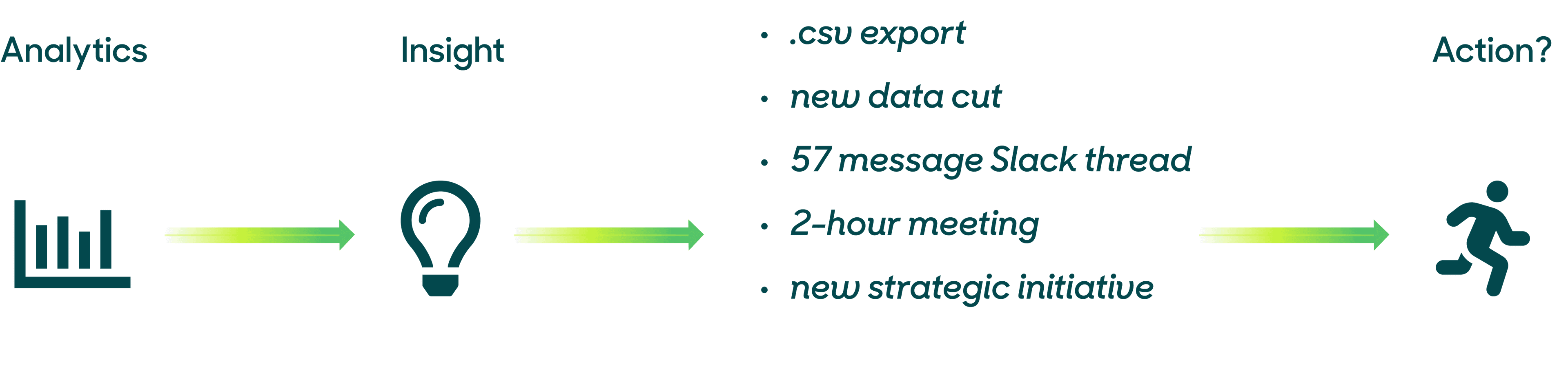
Insights to Action, Using Only BI
Breaking the Cycle and Bridging the “Analytics to Action” Gap
To move beyond dashboards and actually drive action, you need to leverage the insights from your BI tool for Data Activation.
Before Data Activation:
- Your sales team wants a list of product-qualified leads (PQLs) in Salesforce.
- Your marketing team wants to retarget a list of shopping cart abandoners with a Google Ads campaign.
- Your support team wants to see which customers are at risk of churning in Zendesk.
- Your product team wants to categorize users in your production database for your on-site personalization.
Data Activation gives you the power to automatically sync the data from your dashboards directly to your operational tools so your business teams can take action on it immediately. What’s more, with advanced platform governance and customizable permissions in Hightouch, you can maintain control and peace of mind as users access various data resources.
Insights to Action, with Data Activation
After Data Activation:
- With PQLs available in Salesforce, your sales reps can personalize their outreach and prioritize accounts in real-time based on relevant product usage data.
- With abandoned cart data readily available in Google Ads, your marketing team can experiment and launch campaigns unencumbered.
- With a churn score available in Zendesk, your support teams can prioritize tickets by your highest-value customers.
- With user categories available in your production database, your product team can create user-level recommendations for your website or app.
“Since building out a modern data stack—that includes Fivetran, BigQuery, Looker, and Hightouch—we’ve enjoyed a 7-point improvement to our Net Promoter Score. We use Hightouch to sync modeled data directly from Looker into Zendesk, and as a result of having actionable data in their preferred tool, our success team has achieved a 33% improvement in median time to resolution.”

Remi Paulin
Data Architect at PrestaShop
The Virtuous Cycle Between BI and Data Activation
As mentioned above, BI isn’t going away–and it shouldn’t. Dashboards are extremely useful for exploring data, identifying trends, and bringing understanding to things that were previously unknown. Data Activation is then used to help business teams take action on those trends to deliver business results. To close the loop, teams should consult their BI tool to assess the efficacy of those activation strategies and fine-tune their activation activities from there. The cycle should look something like this:
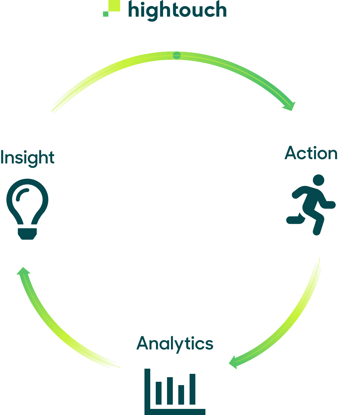
The Virtuous Cycle Between BI and Data Activation
Here are a few examples of how this virtuous cycle could work in practice:
-
Let’s say you’re on the product team at a product-led growth company. You’re likely trying to figure out how to measure and activate your Product Qualified Leads (PQLs). A BI tool will help you land on a definition for what constitutes a PQL for your business (Is it someone who signed up for a free account? Someone who signed in ‘x’ number of times in the last month?). No matter what your definition is, you can use Data Activation to engage your PQLs with targeted outreach.
-
If you’re on a marketing team, you’re likely doing analysis in a BI tool to understand what makes a high-value customer. Once you figure out those parameters, you’d use Data Activation to target those high-value customers with personalized ads to drive further conversions.
In either example above, you should go back to your BI tool to see if those targeted campaigns are actually resulting in improved metrics (Has revenue increased? Are you seeing an uptick in leads? Are you closing more deals?), and then you should continue to use those insights to fine-tune your activation campaigns.
Get More Mileage out of Your Dashboards
It’s really easy to get started. With Hightouch, you can activate your existing BI models and sync them directly to over 100 SaaS tools, including Salesforce, Google Ads, Iterable, and many more. Here is a video tutorial on how to sync your existing Looker Looks into virtually any destination. If you’re a data analyst who feels that your insights are going to waste, this is great news for you.
“I don't think I've seen a tool that bridges the gap between data practitioners (analysts, data engineers, analytics engineers) and end business users like Hightouch. Hightouch has improved our offline data flows into 3rd-party platforms ten-fold. Hightouch makes it super easy for both teams to collaborate on data transfers, make adjustments/improvements over time, set up alerting to notify of data downtime, and more.”

Mallory Reese-Bagley
Sr. Marketing Operations Manager at Lucid Software
We know funnel dashboards are great in a lot of aspects, specifically in understanding the inputs and outputs of your process. But these dashboards shouldn’t be the final destination of your analytics workflow. You can help teams take action on data—and get back some precious time and sanity—by syncing data directly into the SaaS tools that your business teams live in. Learn more here or sign up for a free Hightouch account.